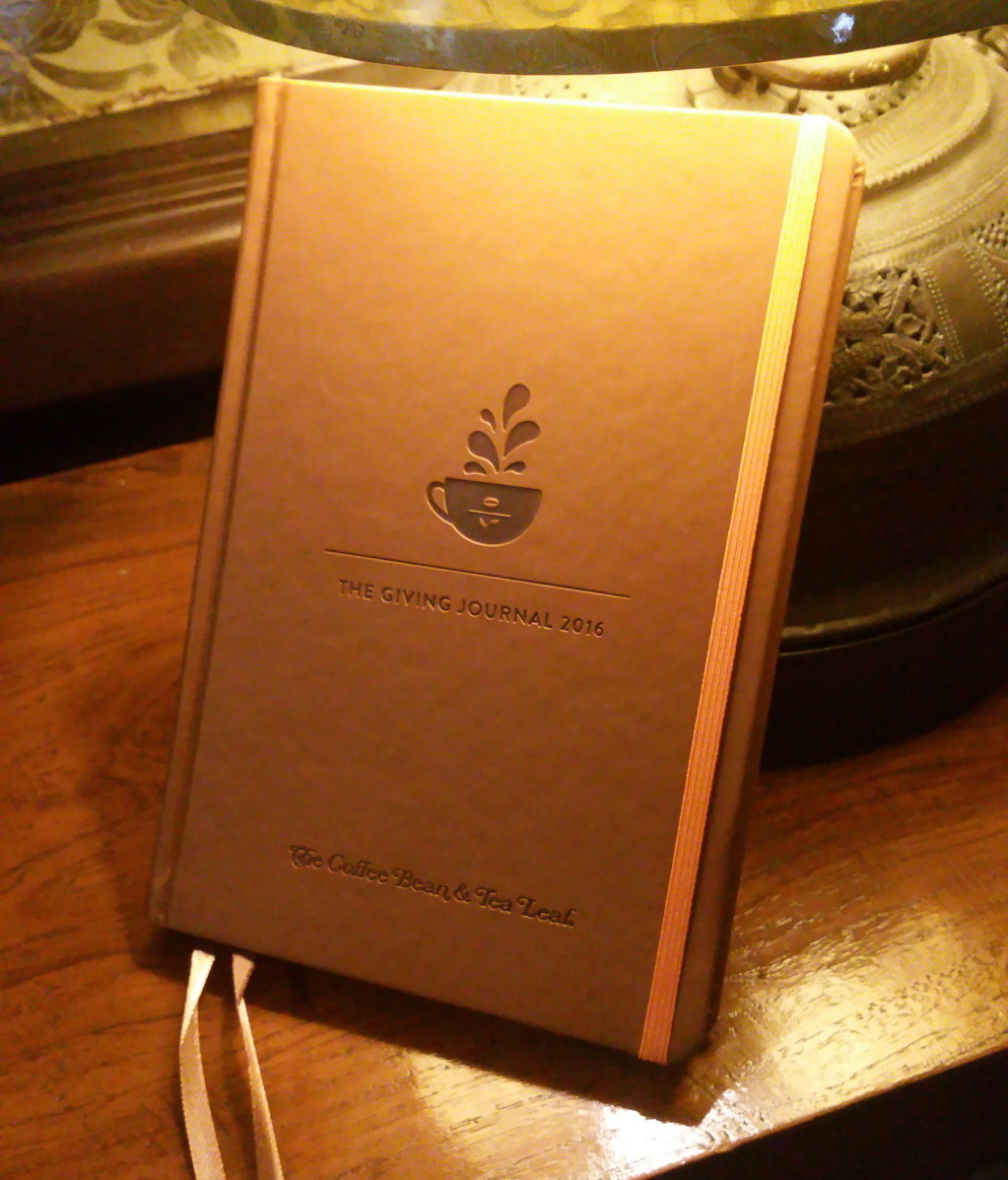
Hi folks! Liz Lanuzo of Project Vanity graciously lent me her Giving Journal for me to check out. I thought I’d share with you some shots of the cover and interior for you to make up your minds about whether to go for this yearly diary, the Starbucks Moleskine 2016, or Seattle’s Best diary. I hope you don’t go for all three- you might get diabetes from all those crazy frappe drinks they make you buy to get one of these!
Here goes:
The cover. It’s tan faux leather, very simple and clean design. Quite smooth and slick. I’m not sure it’s waterproof- water might stain it, so keep away from coffee.
There’s some info about CBTL. Next we have some background on The Giving Journal. Apparently it’s working with the Real LIFE Foundation which has something to do with education.
This seems like a worthy endeavor although who knows what that really means? Do they get a portion of each Journal distributed or what??? I wish they’d tell us. I hope those street children are getting something out of this!
Then we have a recommended user’s guide to the Journal, as well as a “Vision List” to help you list your various Goals for 2016. I kinda like this part, it seems useful for those January 1 resolutions that we always forget (or ignore) in a week.
Then there’s some self-empowering poetry. Moving on….
There’s a page about drawing your inspiration for the year. Again, I like that they encourage you to visualize your goals. You’re out of luck if all you can draw is a stick figure though. I guess you can write them down. But all in all, it’s a great idea to visualize your goals, desires, and inspiration.
Next, a page of your best 2016 moments of the month, and Travel Plans. I like the Flavorful Moments one better because in a way, it encourages you to be grateful for the joys of the year- and gratefulness leads to health, as they say.
As for Travel Plans…one can dream. Sigh.
Ah, a calendar! Finally, we get to the bones of the diary. Let’s not forget the coupons though. I seldom use them because I hate tearing things out of a planner, but if you drink CBTL enough to get a Journal, I suppose you will have lots of use for them.
I love this! So much space to mark with washi tape and stickers and your plans, of course! You have one month spread over two pages.
Then you get one week over one page, and notes to elaborate on the facing page. Again, I like that the days of the week are dated. The Midori planner doesn’t have dated weeks. And I really really love grid layouts. Reminds me of the Hobonichi. You can also easily use it for Bullet Journaling.
There are both blank and grid pages at the back for final notes. Good to use these pages for important information like address and passwords (in code, preferably).
Finally, you get a pocket folder for receipts and ephemera and stickers. Stickers!!! I wish they included more, but at least they have them.
And there you have it! Here’s a final assessment:
PROS:
- Very sturdy binding.
- Orange ribbon to hold it closed.
- Simplicity in style- besides the coupons and extra goals pages, the calendar pages themselves are clear, well marked, and well arranged.
- The paper is thick and can withstand fountain pens.
- Ribbon bookmarks.
- Cute stickers.
CONS:
- The smooth cover feels like it will scratch easily and will be a fingerprint magnet. I wish they’d put some texture on it, like the Moleskine covers.
- Hardbound- this is a con for me because I like lighter journals, but for others this might actually be a Pro. I’d like a softbound journal so I can insert it into my fauxdori covers.
- It’s very…sepia. Which makes sense, since that’s the color of Coffee and Tea. If you don’t like brown or variations of it, there’s no other option. EDIT: I think there are other colors for the covers, but I’ve no idea about the insides. Thanks for the info, Pat!
All in all, I think I prefer this journal to the Starbucks 2016 Moleskine- but then again I’m biased because I don’t like Moleskines! Thanks for reading!


1 Comment